

There’s an old Swedish proverb that says, “The best place to find a helping hand is at the end of your own arm.” This is not only true in life, but it’s also true in the case of reports and dashboards!
Acumatica users have already chosen a powerful cloud ERP with good reporting. Using the built-in Power BI tool, it can be easy to get reports and drill down into the data to learn more. For companies with basic reporting needs, this will often be enough.
However, I have worked with companies who need more powerful BI than is available in Acumatica. This is where DataSelf is a game-changer. These businesses need custom reports with advanced analytics. They may have end-users who aren’t technical and don’t have time for training. Many need BI that can consolidate data across several systems such as multiple ERPs, CRM, and POS. (For more examples, watch this 7 minute video.)
These businesses see their users of BI reports or dashboards having problems. Usually they say the following are their biggest challenges:
- Waiting or winging it: Users need reports refreshed to get the latest information at their fingertips. Too often, they don’t have it. This means they must come up with a decision based on reports that aren’t available. They either must wait or ask a consultant for a customized report. This can take hours, days, or even weeks. Or, they may have to wing it. This means they’ll make decisions without proper information. Either way, waiting or winging it is not best choice.
- Too slow to refresh: Sometimes users do have the reports, and the reports do have information. But when they press the refresh button, it just takes too long to refresh. Sometimes it’ll take several minutes. Sometimes even hours. I’ve heard many stories where people must run reports overnight, because otherwise it just takes too long and can bring down data sources, like the ERP system. So, running too slowly is another challenge that I hear people voice often.
- Can’t customize reports: Business changes rapidly. People need to take existing reports, slice and dice them, drill down to details, or even create reports from scratch without having to call a consultant. Because if they can’t find the answer themselves and must call someone, most likely it’ll take a long time to get the answer. Then it goes back to waiting or winging it. This is the most popular challenge I hear users voice when it comes to their own reports and dashboards.
What do users want from their reports and dashboards?
- Information anytime and anywhere: Users want to be able to access reports when and where they need them. Sometimes that may be on their desktop. It might be on a browser. Or maybe on their mobile device. Anytime, anywhere, they might have questions that they need to find the answer to. So, giving users the information they need – by email, on their own schedule, is what they want. You need to have a platform that provides that kind of mobility, delivering information in different ways and in different formats.
- Fast reports: Reports must run in seconds. No matter how much data you have, if a report takes more than 10 seconds to run on average, will not wait. So, you need a reporting platform that will deliver reports in seconds.
- Customizable: Being able to customize your own reports and dashboards is critical for efficiency and user adoption. This platform must be easy to use, so that users can learn to do things that would otherwise require consultants and precious time. In our experience with the DataSelf platform, users, or someone on their team, can handle more than 70% of their own custom reporting needs. These are changes that would require experts on other platforms. This simplicity and customizability is also critical to user adoption because if a user is unable to customize a report to their specific needs, they will say it doesn’t help them and move on.
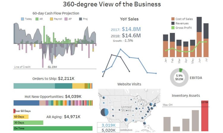
A 360-Degree Dashboard
DataSelf is a certified Acumatica product. This BI tool builds on the power and flexibility of Acumatica with even more powerful reports and dashboards.
This example of a self service report was developed by C-level executives for C-level executives.
In this case, you’re looking at an out of the box report that shows a 360-degree view of the business. Here, we have information coming from several data silos.
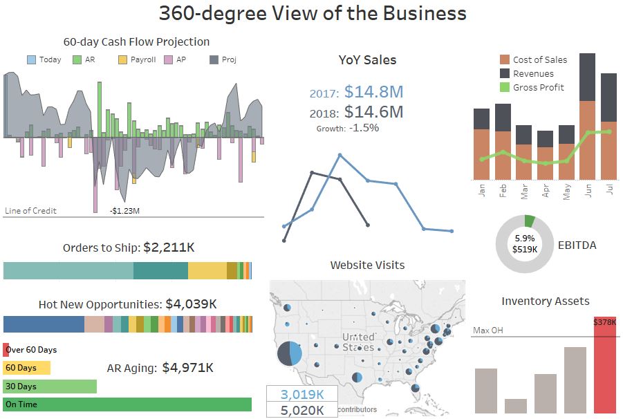
On the top left is a 60-day cash flow projection. You can see your receivables, your payables, your payroll, and your cash on hand today.
When you add all the inbound and outbound money, you can see what the projection of your cashflow will be for the next 60 days.
If the most negative amount doesn’t cross your line of credit, you shouldn’t have a problem.
So, this is a quick and easy way to see how your cashflow is doing.
It’s important for this dashboard to be actionable. For example, we have built in a what-if scenario in this cash flow. For example, what if I’m looking at this dashboard and I know that a payment is not going to come in. I can exclude the payment and see if that will affect my cash flow, and then do something about it.
Being able to use these dashboards to explore such what-if scenarios will make these dashboards not only informative, but actionable. They help you make better decisions in a timely fashion.
The left side of the dashboard shows lead metrics, which are metrics looking to future transactions. On the right we have lag metrics. These are metrics about the past performance of the business, like revenues, Google Analytics, and more.
Overall, we use red colors as an alert. For example, in the case of inventory in the lower right, my inventory assets are too high. Why is that?
I’m wondering if this is being taken care of. Do I need to contact someone to take care of it? Well, typically, if you see something isn’t doing well, you’ll want to learn more about it before you act.
You can click on the red bar, and this will drill down into a more detailed segment of the dashboard that shows inventory information.
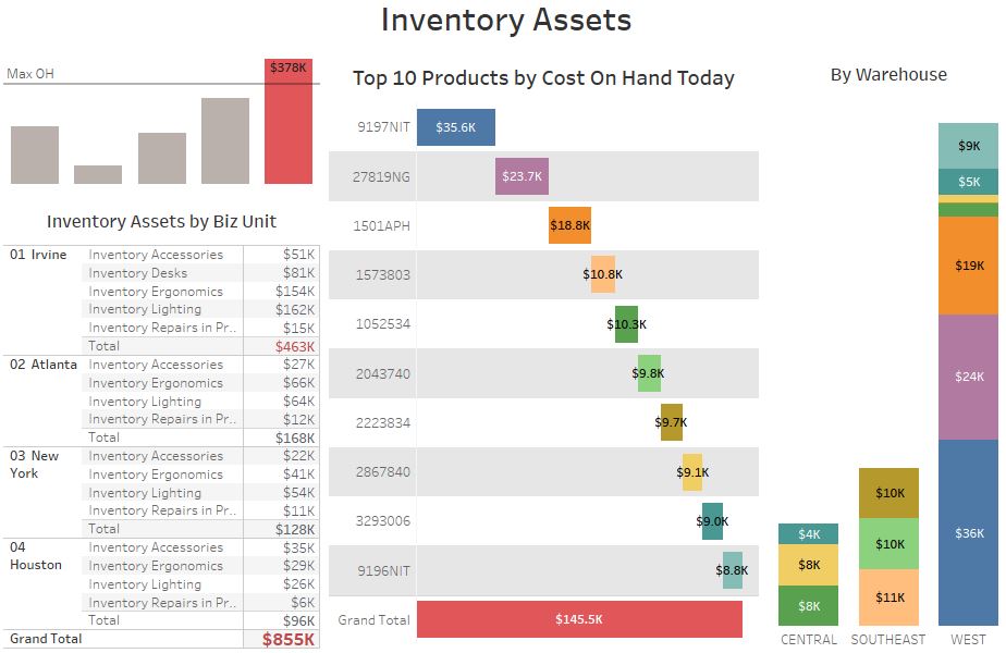
This shows inventory by business unit, and the top 10 products, by cost, on hand today.
In this example, it’s about $40k. It shows as red because it’s above my threshold.
Now notice that most of my excess inventory is in the West warehouse. I may want to contact that warehouse manager. In real life, if you’d need to contact someone, you may not know who the person is, or you may not have their phone number or email address. You might have to spend some time just trying to figure that out.
Instead, with these dashboards, you can just click on a label, in this case the West warehouse, and you’ll have a link to email or call the manager.
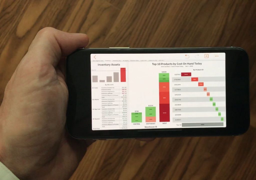
If you do this from a cell phone, you can:
- Visit the dashboard from your phone
- Click on the red label for West warehouse
- Click to call the manager
The app will place the call right there from the smartphone.
Advanced BI Reporting and Dashboards for Acumatica
When C-level users can create and use reports like this without involving IT, they truly have all the helping hand they need at the end of their own arm.
But wait, there’s more! Any of these out-of-the-box dashboards can be customized by the user easily. Find out more in another blog coming soon. You can follow DataSelf on Twitter to see when Part II is published.If you want to learn more about Acumatica self-service reports and dashboards, or about DataSelf Analytics, you can find my contact information on our website. www.DataSelf.com