


Custom, self-service BI might seem like an oxymoron. Users expect anything that is self-service will be standard, built-in reports. These might be easy to get, but they may not be what is needed. Users also expect custom reports to require technical knowledge, take time to create, and be expensive to maintain.
Yes, you can have custom, self-service reports for Acumatica using DataSelf, a certified Acumatica product. Acumatica’s out-of-the-box analytics tool is good—better than what is available in most other ERP software. But, many companies need more. You can learn about when Acumatica users need DataSelf in my previous blog or by watching this 7-minute video.
A Salesperson Dashboard
Let’s look at two examples of self-service reports and dashboards using DataSelf.
The first example is an out-of-the-box dashboard for salespeople.
Here, we have metrics that are critical to a salesperson’s success and important to watch every day.
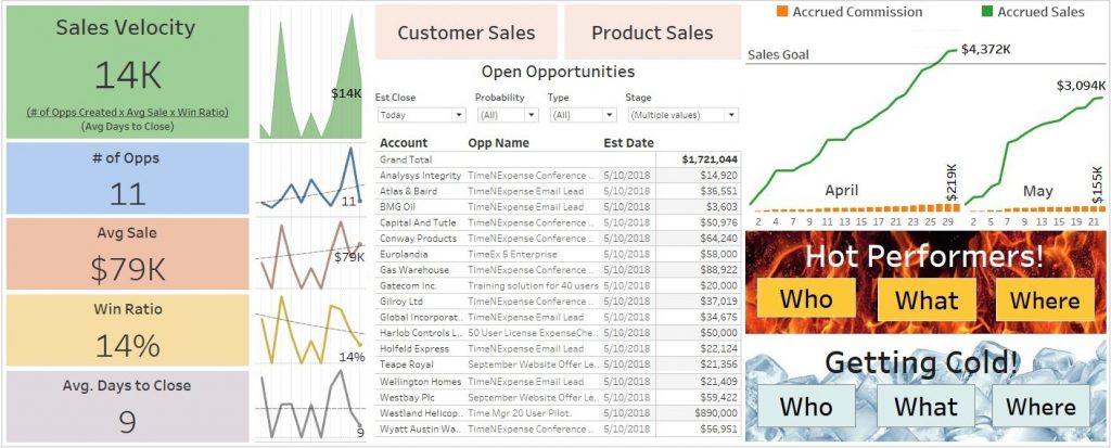
At the front and center is information about what the salesperson needs to do today. On the right is their commission information. This is their actual commission from sales on a daily basis. In the bottom right they can see the hot and cold performers.
The idea here is to see who’s hot, what’s hot, and where it’s hot, as well as who’s getting cold, and what’s getting cold.
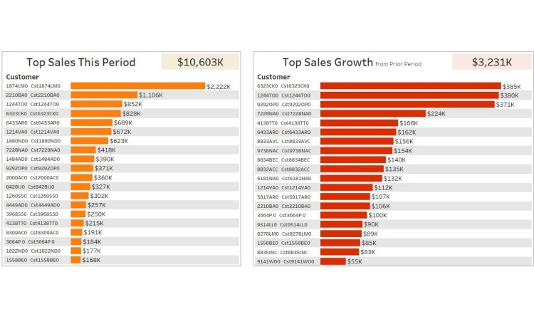
If you want to see who’s hot, you just click the Who button, and it takes you to the following report out of the box, with two ways to look at who’s hot.
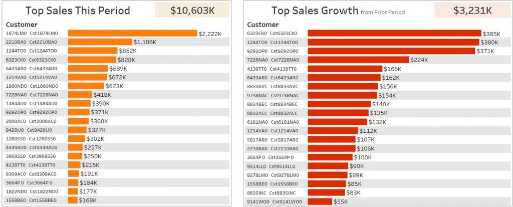
The first report shows top customers by sales this period, in descending order.
The second report shows top sales growth since the prior period. These customers may not be big clients yet, but they’re growing very rapidly. That’s why we call them “hot”.
How do we define the period? Well, you can choose out of the box, to view the period as year, quarter, or month. In this example, we’re looking at year to date.
These are the top customers by sales growth, comparing this year from the beginning of the year to now against last year to this date.
Maybe you also want to see who’s getting cold. Just choose Who’s Cold from the menu.
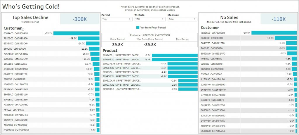
This is the same perspective, but now you have top customers by sales decline since last year to date.
If you put your cursor over each of these customers, in the center area it shows which product or services are driving the biggest decline since last year to date.
On the right side I have an exception report showing no sales. These were the customers that were buying last year to date, but not at all this year to date, in descending order.
This is one example of a self-service dashboard where users can use drop-down lists to view different things and view them from different perspectives.
Customizing Dashboards
This last self-service example is when a user needs to see something different than what is available in an existing report or dashboard.
Here is an example of the self-service report we reviewed in our last blog showing inventory information.
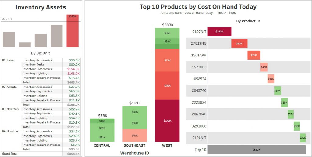
Let’s say that you want to add to the dashboard above, a chart showing your sales and profitability by month over time. With a true self-service BI dashboard, users should be able to do this.
In this example, I’ll click the Edit button. I want to create a new sheet from scratch, so I’m going to click on New Sheet. This gives me access to my data panel.
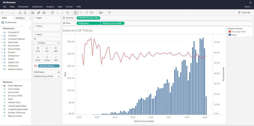
Here, based on my permissions, I see the data sources that are available to me. I want to compare sales and gross profit. So, to start off, I double-click on Sales, which adds them to summing/averaging/aggregating section of the report.
Next, I want to see this over time, so I double click Invoice Date. By default, this breaks my sales out by year. Well, I want to see my report in months, so I’m going to choose Month, and right there I see sales by month for the whole company.
I also want to see gross profit percentage in the same report. I just have to drag and drop Gross Profit Percentage into my report. I also want a dual axis so that I can easily compare them against each other. So, I just click the dual axis chart, and right there I see orange bars for sales, and a blue graph for gross profit. That completes my new chart.
Now, I go back to my inventory dashboard where I wanted to add this report in the first place. I want to add this new sheet right in the middle of my dashboard. So, I just take the new sheet, drag and drop it right into the dashboard, remove the label, and remove the title to make it a little cleaner. Then I click Save and Close and voila, I’m done.
Are you ready for something amazing? Everything above could have been done on a mobile device.
A True Self-Service Dashboard
Again, the ability for users to make changes like this, quickly and easily, is critical to having a truly self-service reporting platform.
If you want to learn more about self-service reports and dashboards, or about DataSelf Analytics, you can find my contact information on our website. www.DataSelf.com